Yes, I'm a day late. Electricity was out most of the day so I couldn't get online. Here we go...
Because it is April and Maureen Johnson's month on my blog, lets look at her books....
 vs.
vs.  vs.
vs. 
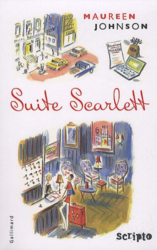
This is actually hardcover vs. paperback vs. French cover. I prefer the one in the middle (the paperback) and it's also the one that I own. I like its simplicity and the New York skyline on the key. A quick glance of the hardcover, I think Scarlet Johansson. And the French cover has too much going on for my taste.
What about you...which one do you like???
What about you...which one do you like???
***


I love the red cover with the key. My second favorite is the one with the woman on it (I'm guessing that would be Scarlett) and my least favorite (by far) is the white cover. I really don't like that one!
ReplyDeleteMy favourite is the one with the girl on the cover. She reminds me of Scarlett :)
ReplyDeleteI'm with Nina. I like the one with the girl.
ReplyDelete